In the world of graphic design, fresh free fonts are our paintbrushes, our sculpting tools, the very notes that compose the visual symphony of our work. But let’s face it, sometimes shelling out for the perfect premium typeface can feel like a major chord change in the wrong key. Fear not, font fiends! 2024 is bursting with fresh, free fonts that’ll elevate your designs without breaking the bank. So, dust off your creative mouse and prepare to dive into a typographic treasure trove:
You may be interested in the following articles as well.
- 15+ Modern CV Resume Templates For 2024
- YouTube vs TikTok: Exploring the Best Platform for Online Earning
- 25 Extremely Creative Photo Manipulation Examples
- Best Brand Guidelines Templates For Robust Brand Presence
Forget about limitations; free fonts democratize design, putting a kaleidoscope of typographic styles within reach of everyone. Budgets no longer dictate creativity, allowing small studios and freelance artists to compete on an equal footing, wielding the same expressive tools as larger players. This fosters a more inclusive design landscape, where diverse voices and aesthetics can flourish.
List of New Fresh Free Fonts 2024:
Download Fresh Free Fonts
Premium fonts might have a “try before you buy” button, but free fonts let you throw the whole box of crayons at the canvas without a second thought. They’re the perfect playground for pushing boundaries, testing out bold choices, and exploring new trends without the financial pressure of commitment. It’s a safe space to learn, fail, and iterate, refining your typographic voice and discovering hidden gems in the font world.
Of course, navigating the vast ocean of free fonts requires caution. Always check license agreements, choose reputable sources, and prioritize quality over quantity. But with a discerning eye and a touch of creative courage, free fonts can become your secret weapon, unleashing your design potential and enriching your visual narratives without breaking the bank. So, embrace the freedom, explore the unknown, and join the vibrant community of designers who know that sometimes, the best things in life are truly free.
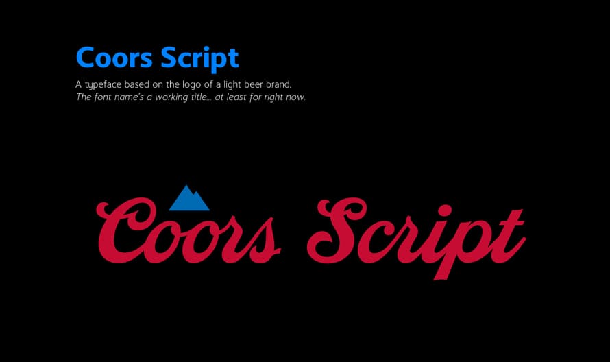
Coors Script Font
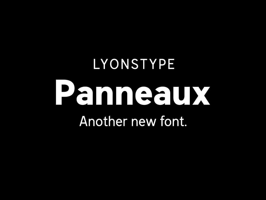
LT Panneaux Free Font
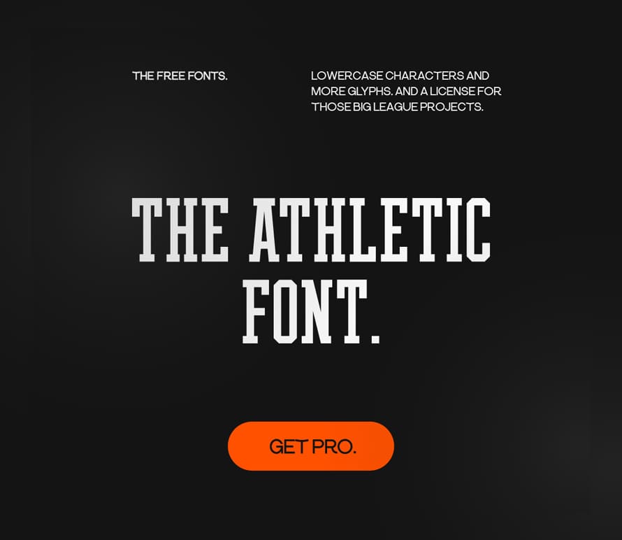
The Athletic Font
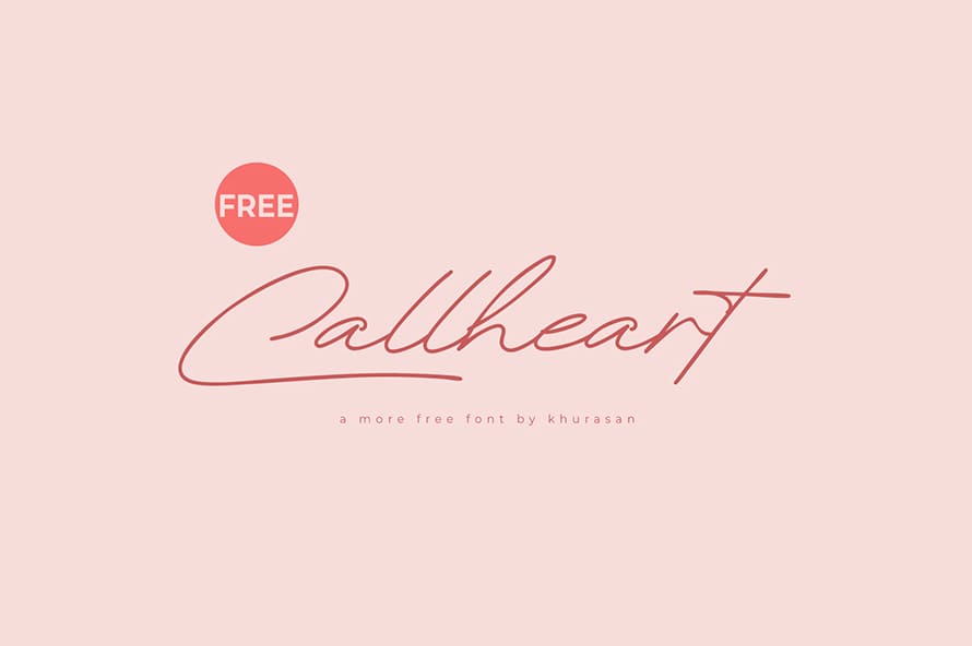
Callheart Font
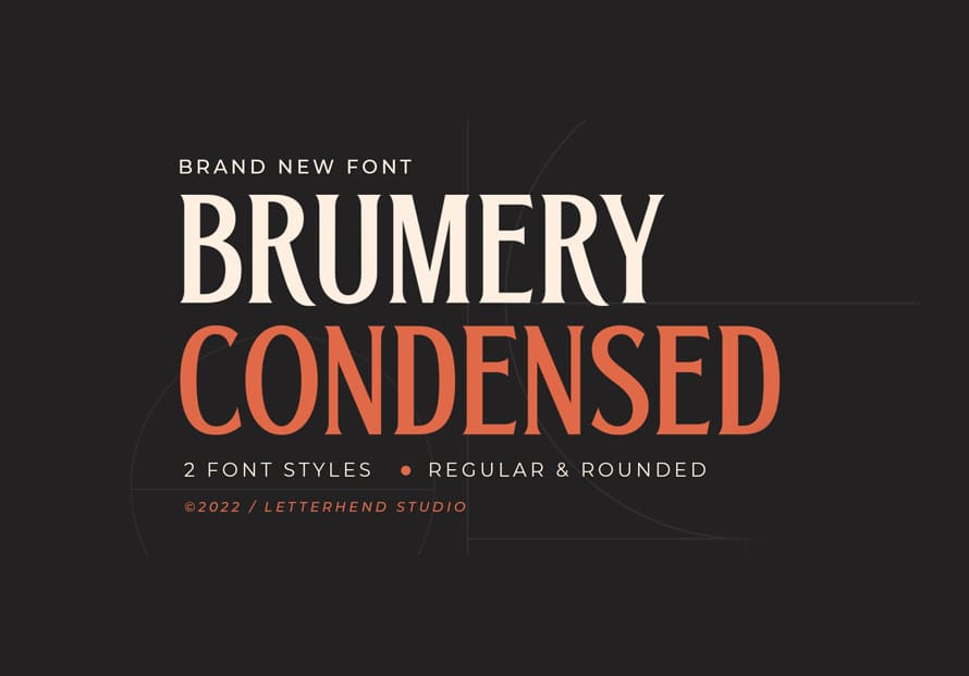
Brumery Font
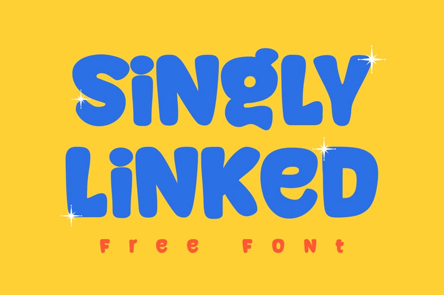
Singly Linked Font
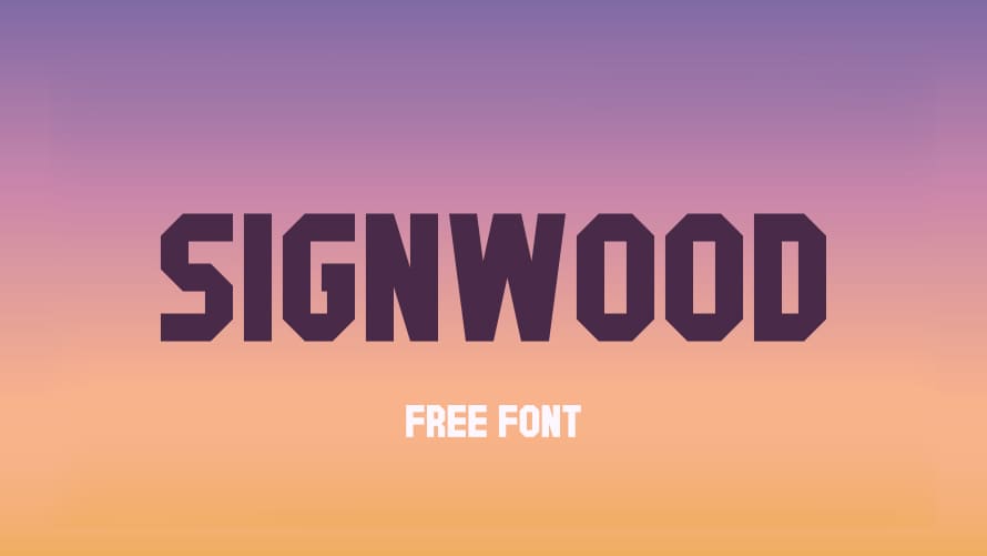
Signwood Font
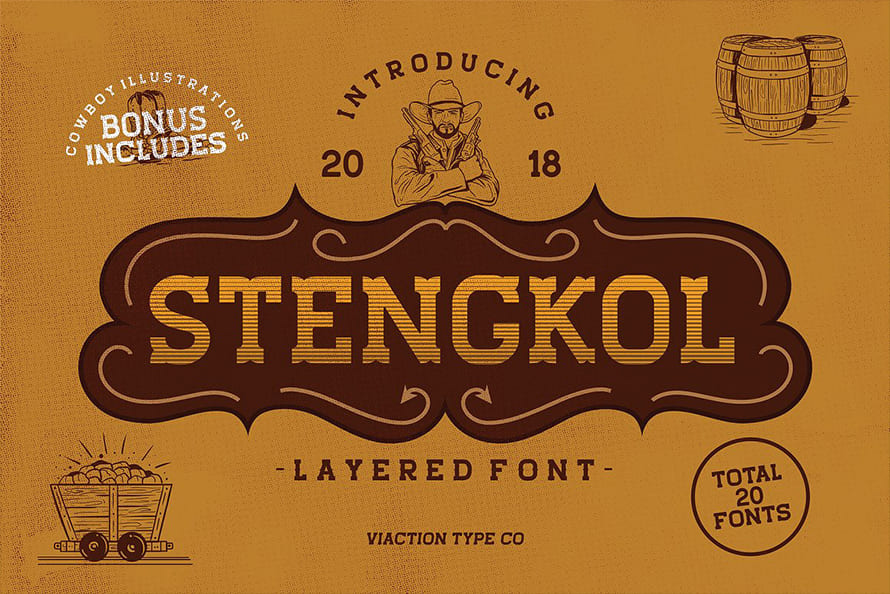
Free Vintage Slab Serif Free Font
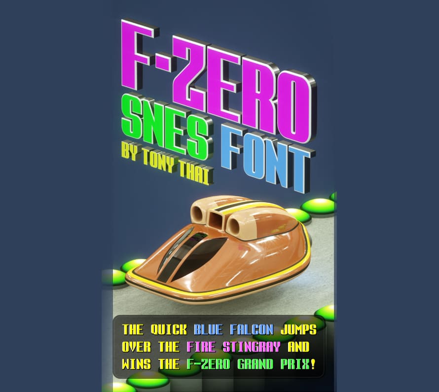
F Zero SNES Font
Calamity Font
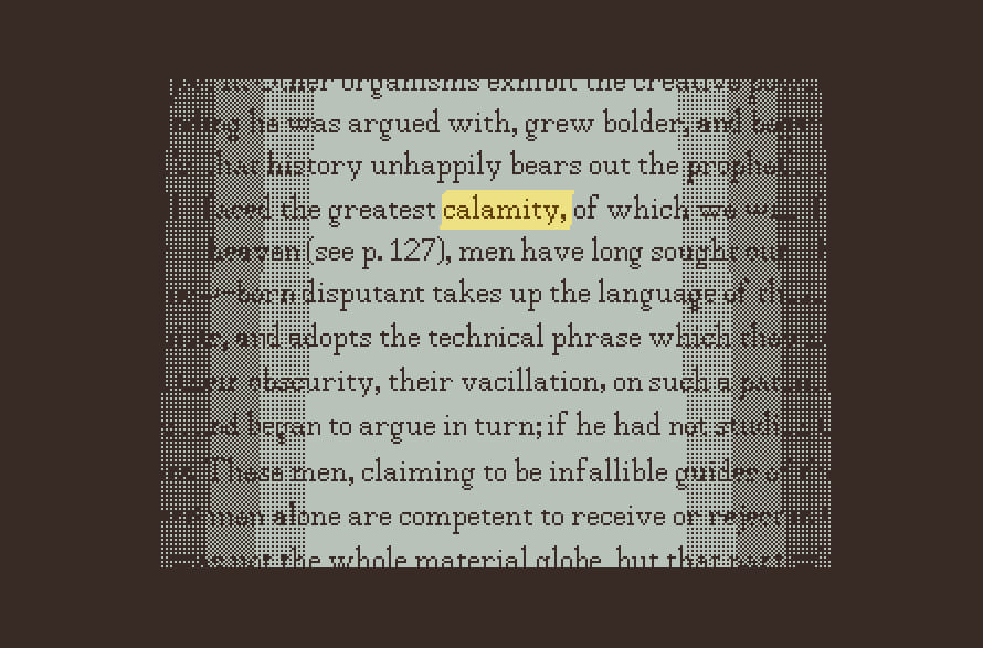
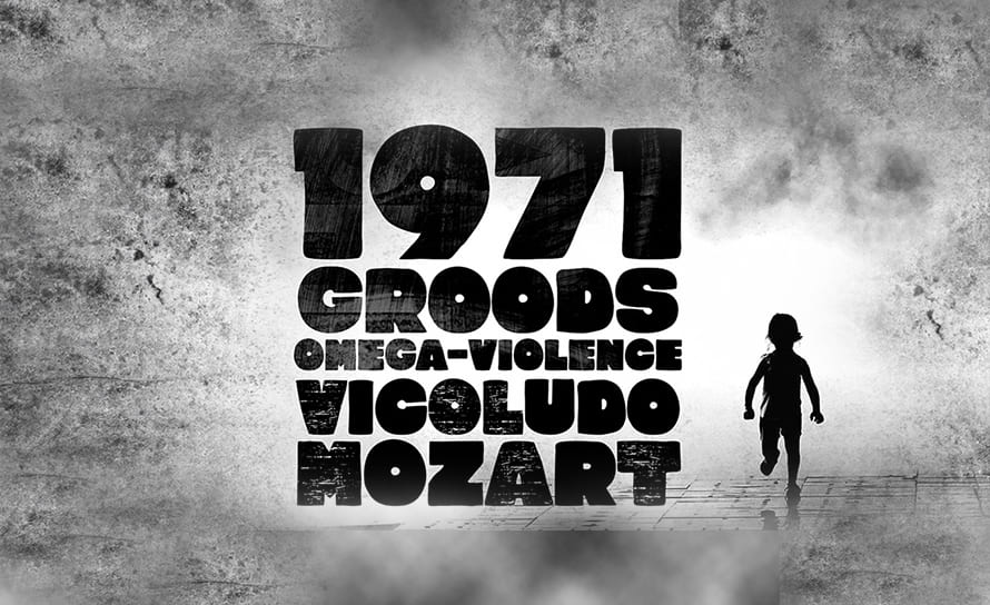
Clockwork Lemon Font
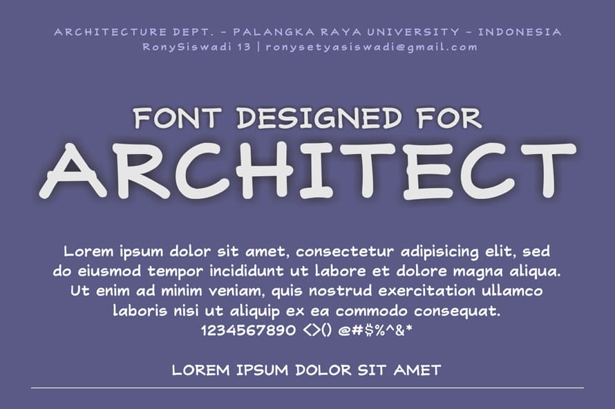
RonySiswadi Font
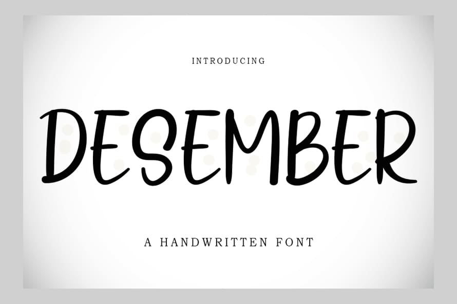
Desember Font
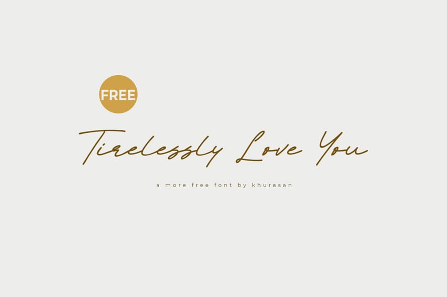
Tirelessly Love You Font
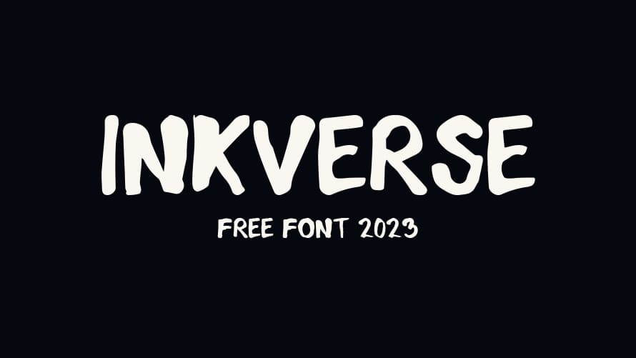
InkVerse Font
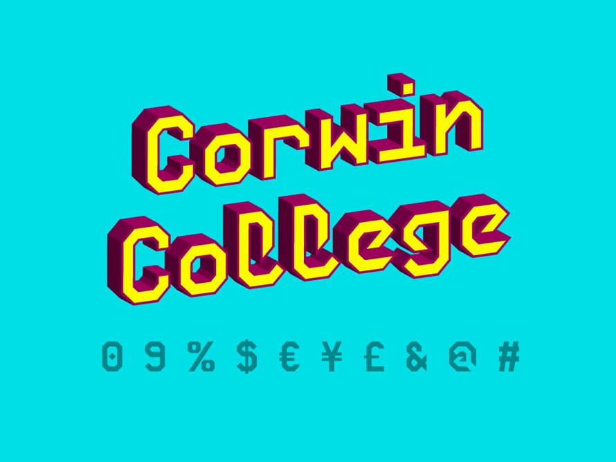
Corwin College Font
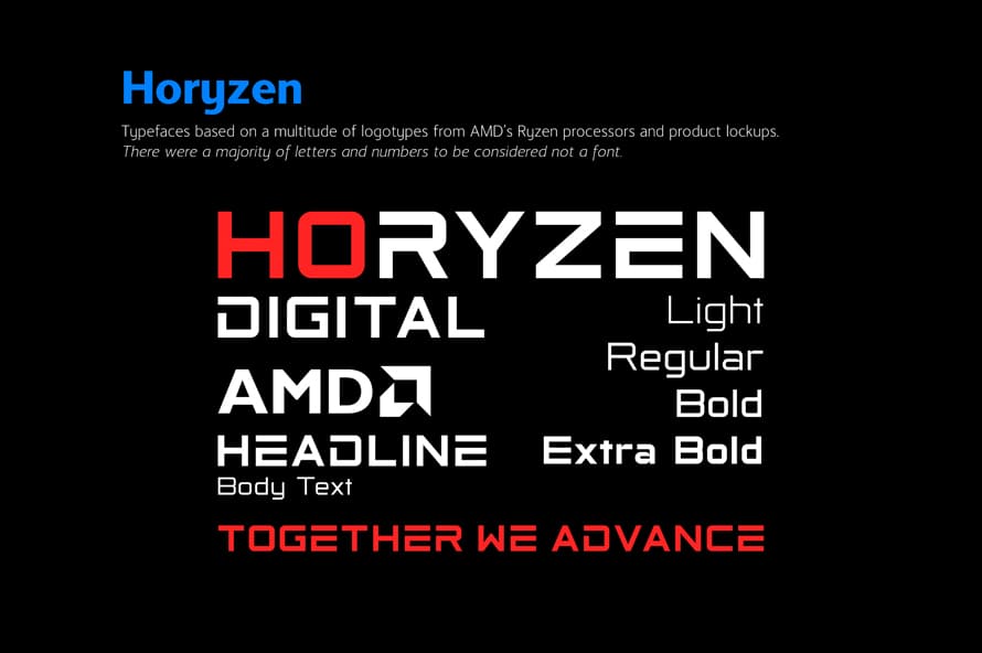
Horyzen Font
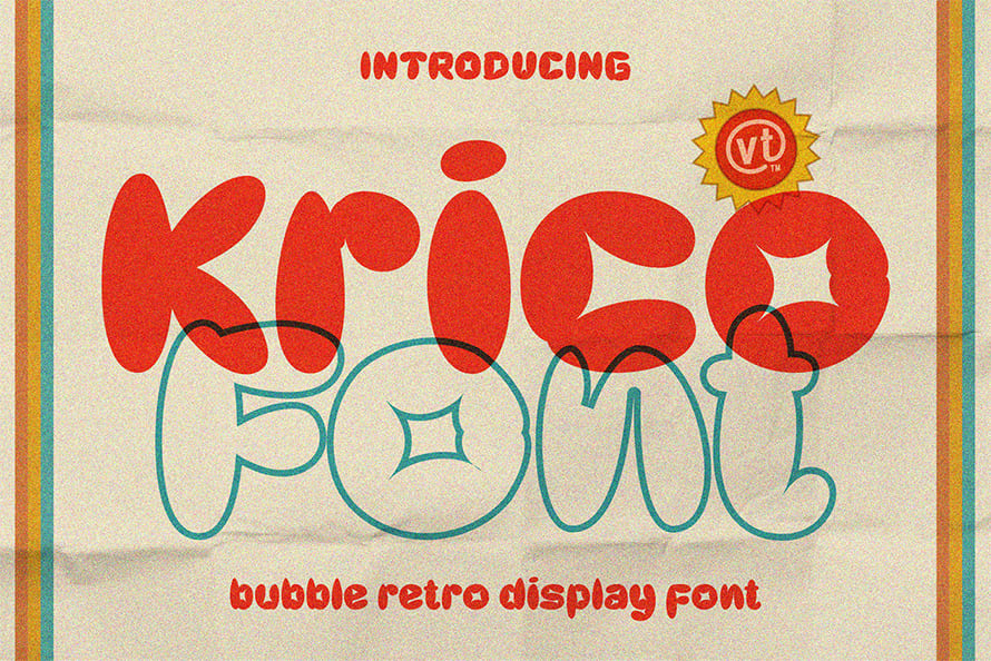
Retro Bubble Font
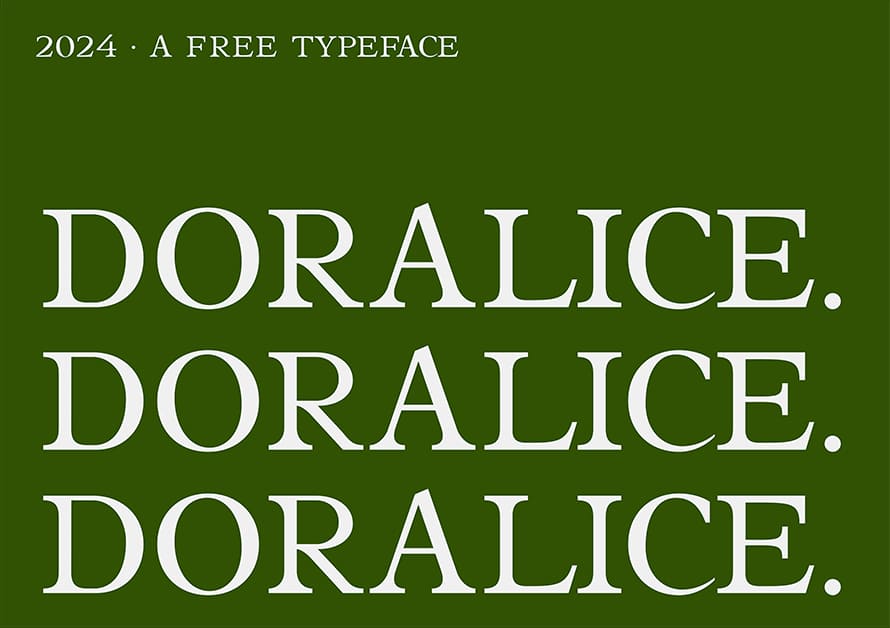
Doralice Font
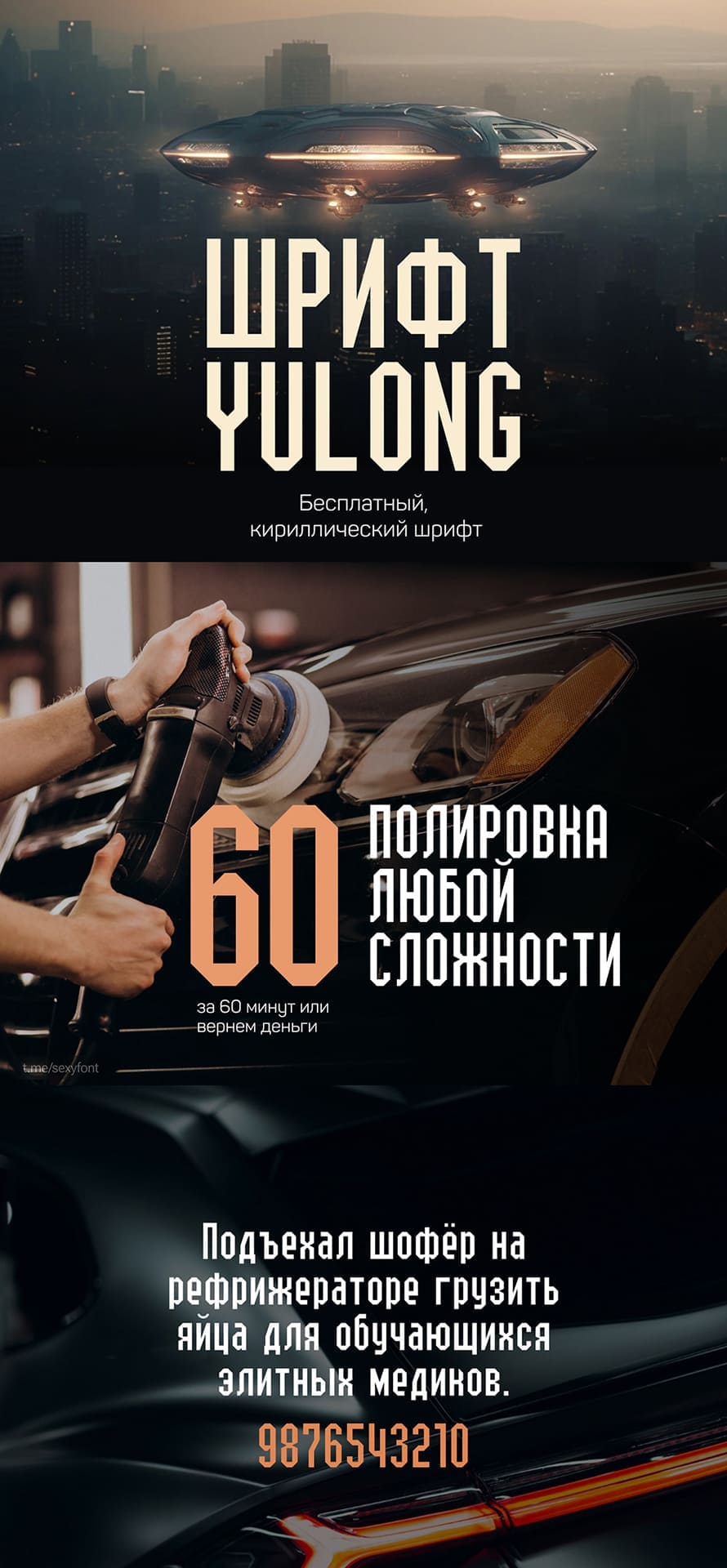
Yulong Font Font
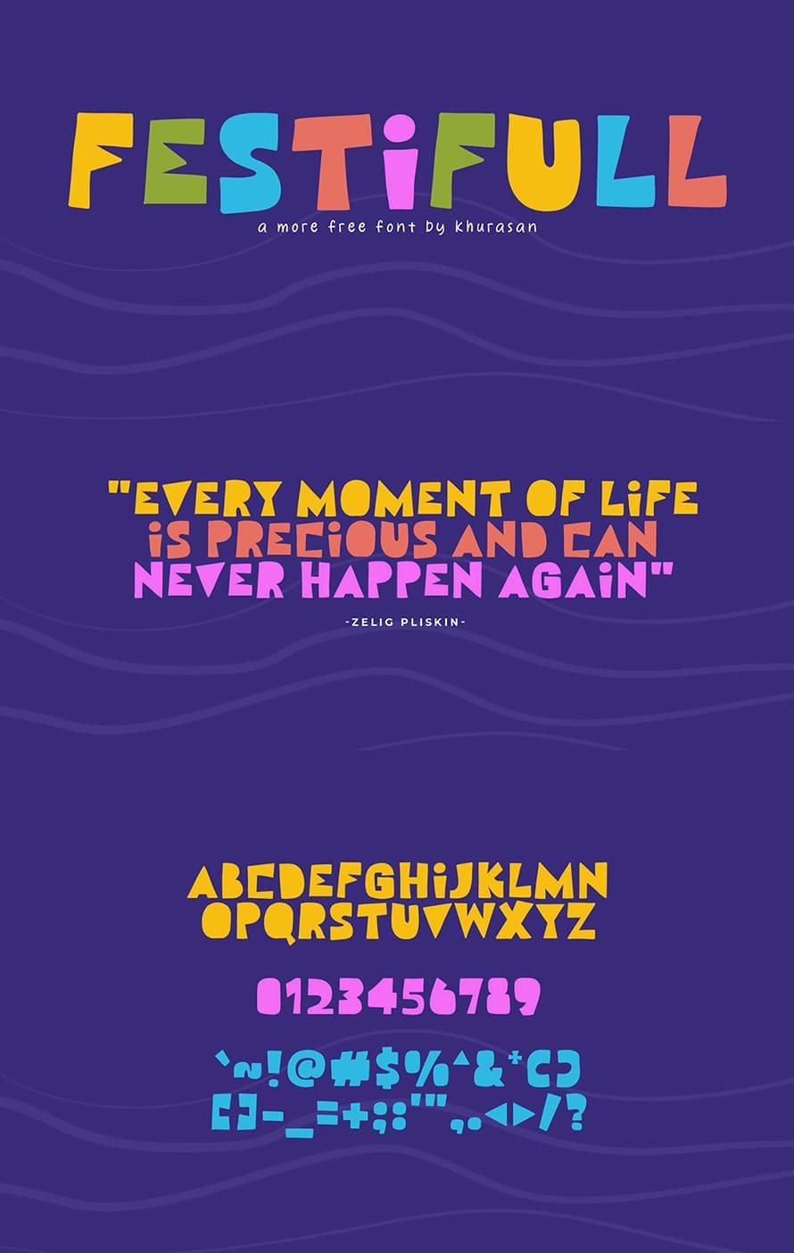
Festifull Font
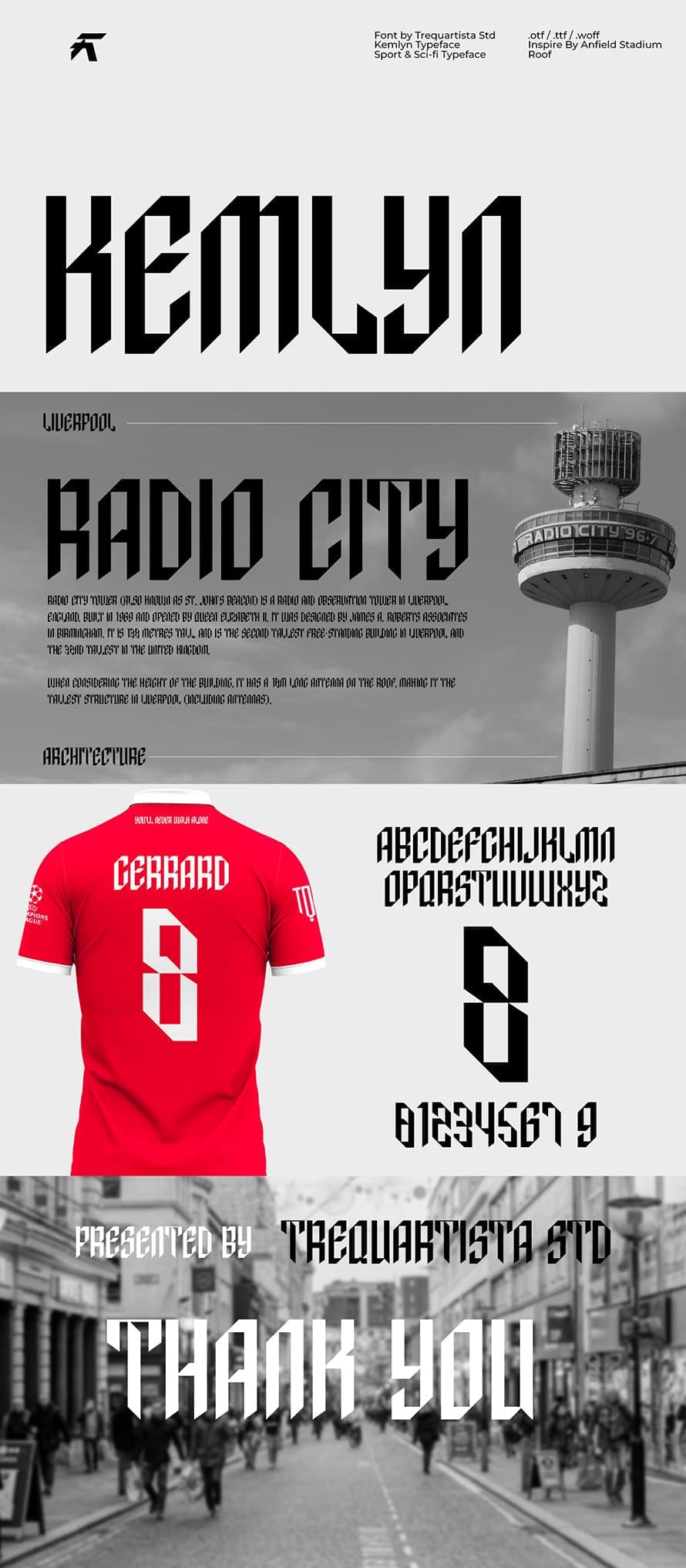
kemlyn Font
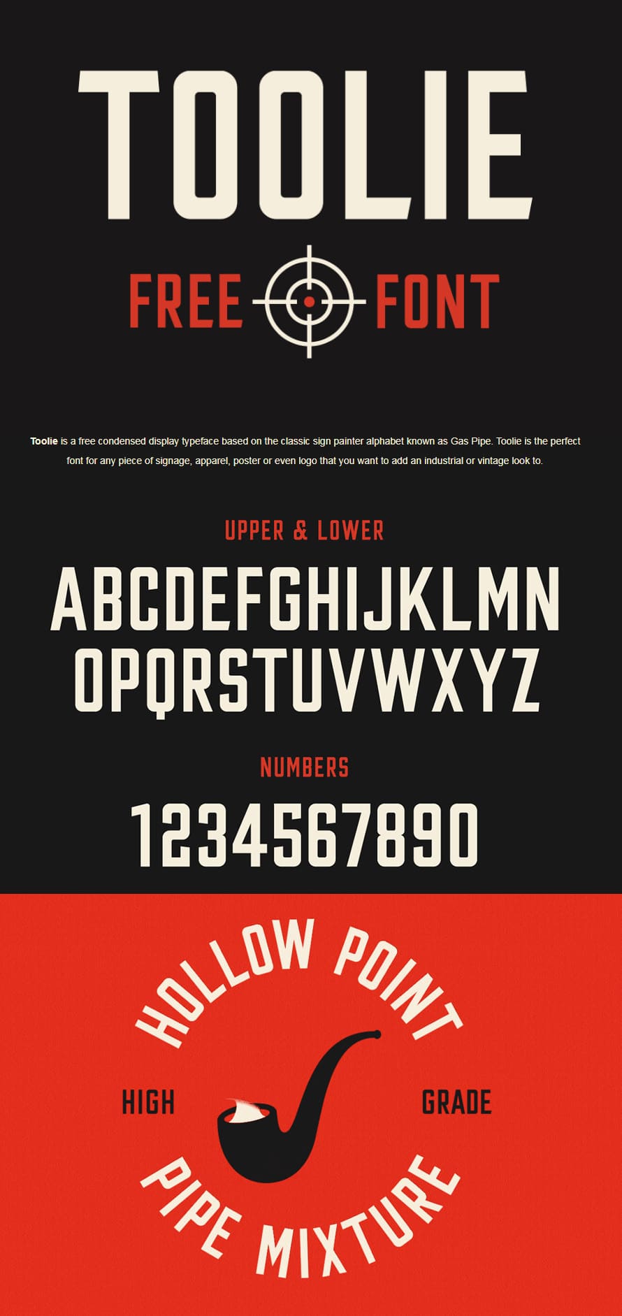
Toolie Condensed Font
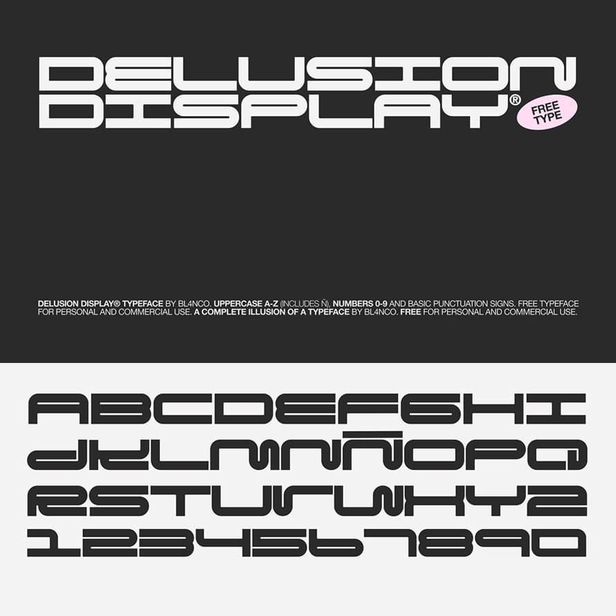
Delusion Display Typeface Font
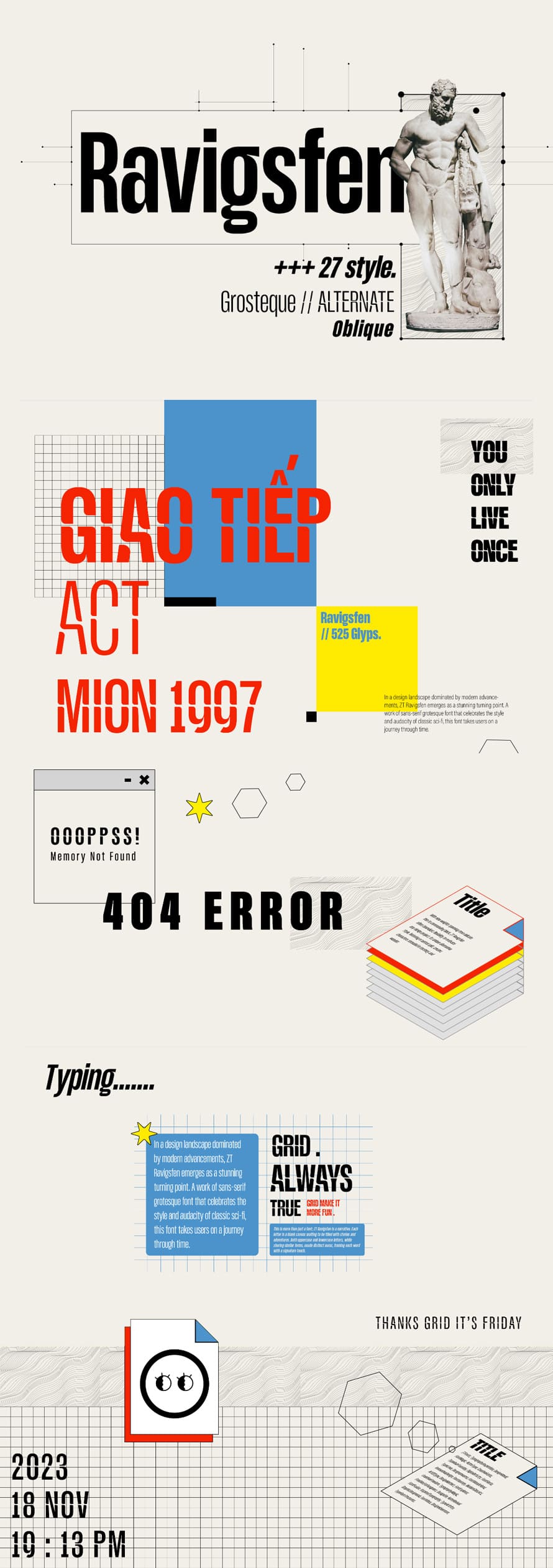
Ravigsfen Font
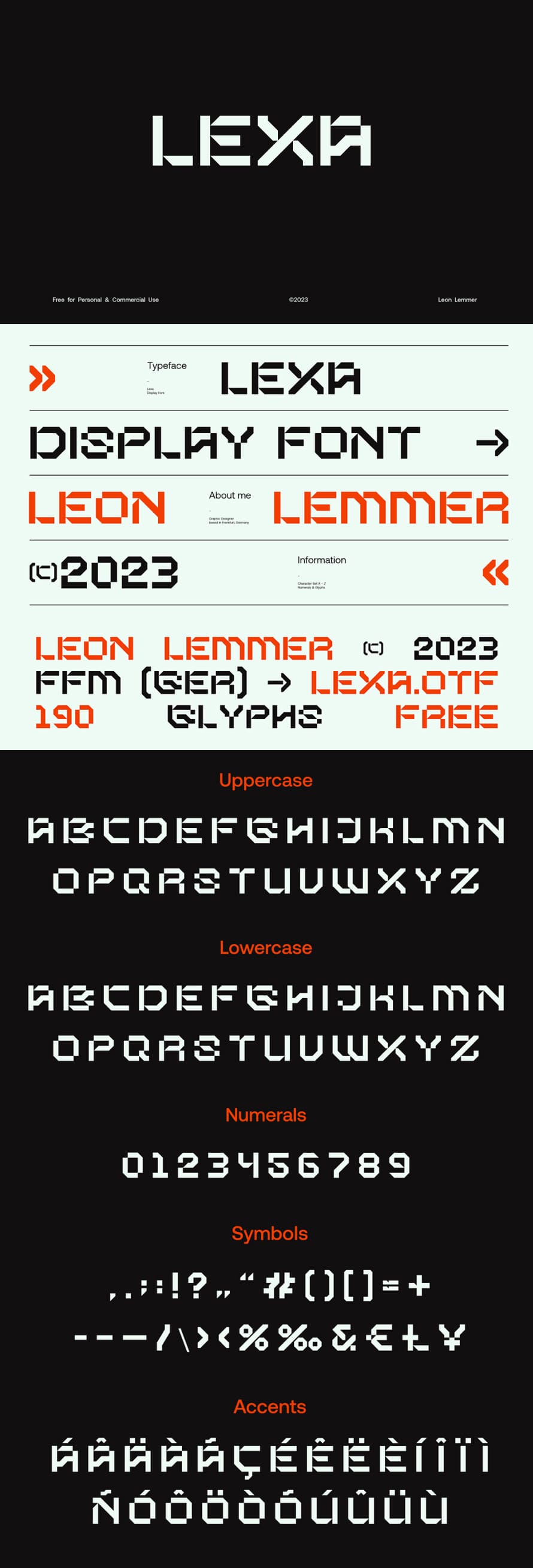
Lexa Display Font
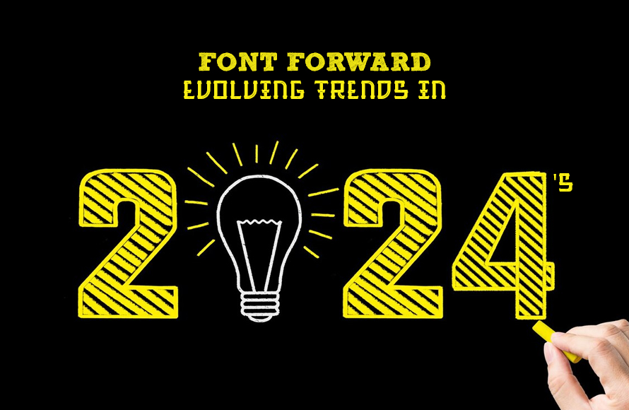
Font Forward: Evolving Trends in 2024’s Typographic Landscape
The world of fonts, once considered a static realm of neatly categorized serif fonts and modern sans-serif fonts families, is experiencing a vibrant renaissance. In 2024, the lines between convention and experimentation are blurring, birthing a kaleidoscope of trends that push the boundaries of visual communication. Buckle up, typography enthusiasts, because we’re diving into the five most captivating font trends taking center stage this year:
1. Retro Reimagined: Nostalgia is at the helm, but with a twist. Expect to see classic styles like Art Deco and 90s grunge reimagined with contemporary flair. Think rounded serifs with unexpected flourishes, chunky geometric sans-serifs, and pops of neon reminiscent of arcade nostalgia. These fonts exude a playful sense of familiarity, injecting a dose of vintage charm into modern contexts.
2. Shapeshifters on the Loose: Goodbye, static letterforms! 2024 welcomes the era of the shapeshifter, where letters morph and dance, defying the confines of traditional typography. Imagine bubbly, hand-drawn characters that ooze personality, letters merging and splitting like liquid gold, or even interactive fonts that respond to user input. This trend pushes the boundaries of legibility, embracing a fluid, artistic expression of language.
3. Pixel Perfect: Get ready for a blast from the past – pixelated fonts are making a comeback, and not just for retro gaming logos. Expect to see chunky, blocky letters reminiscent of 8-bit graphics adorning everything from packaging to websites. This trend taps into our digital nostalgia, injecting a playful, futuristic charm into modern designs.
4. Brutalism Takes Hold: Inspired by the raw, exposed aesthetics of Brutalist architecture, this trend embraces bold, stark fonts with heavy weights and minimal embellishments. Think chunky slab serifs, condensed sans-serifs, and stark geometric shapes. This trend conveys a sense of raw power and directness, perfect for brands seeking to make a bold statement.
5. The Human Touch: In a world increasingly dominated by digital screens, there’s a growing yearning for the warmth and imperfection of the human touch. Handwritten-inspired fonts, complete with wobbly lines and subtle imperfections, are taking center stage. These fonts bring a sense of authenticity and intimacy to design, adding a touch of vulnerability and personal expression.
Beyond these prominent trends, 2024 promises a year of experimentation and inclusivity. We’ll see fonts embracing playful textures, utilizing animation and 3D effects, and incorporating diverse cultural influences. It’s a time where legibility isn’t a rigid rule, but rather a malleable concept that bends to the creative vision of the designer.
The Unsung Hero of Graphic Design – Fonts
Imagine a world where every sign, label, and headline screamed the same message in the same monotonous tone. Dull, right? Graphic design thrives on visual storytelling, and fonts are the unsung heroes of this captivating narrative. They’re not just letters on a page; they’re the actors, the costumes, and the dramatic pauses that bring visual communication to life.
Here’s a sneak peek into why fonts deserve a standing ovation in the graphic design realm:
1. Setting the Stage: Tone and Personality
A bold, blocky font screams “attention!” while a flowing script whispers elegance. Fonts have the power to shape the entire mood and message of a design. Imagine a children’s book with a stern, gothic font – not exactly bedtime story material, is it?
2. Guiding the Eye: Hierarchy and Clarity
Fonts create a visual hierarchy, guiding the reader’s eye through the information like a skilled tour guide. Headlines demand attention with larger, bolder fonts, while body text takes a backseat with a clean, readable style. This organization ensures smooth information flow and prevents viewers from getting lost in a typographic jungle.
3. Embracing Diversity: Expressing Uniqueness
Just like personalities, fonts come in a kaleidoscope of styles. A vintage poster might choose a timeless serif font, while a futuristic website might opt for a sleek, sans-serif look. The right font choice becomes an extension of the brand or message, adding a layer of depth and uniqueness.
4. More Than Just Words: Creating Harmony
Fonts are the building blocks of visual balance. Their size, weight, and spacing can be meticulously crafted to create a harmonious composition. Think of it like musical notes; each font plays its part, weaving together a visually pleasing symphony.
5. Accessibility Takes Center Stage
Graphic design isn’t just about aesthetics; it’s about inclusivity. Choosing fonts with good legibility and considering factors like size and color contrast ensure everyone can access and understand the information.
So, the next time you admire a stunning poster or navigate a user-friendly website, remember the silent power of fonts. They’re the invisible orchestra conductors, the chameleon-like actors, and the unsung heroes who transform words into a captivating visual experience. In the world of graphic design, fonts are more than just letters; they’re the very essence of visual communication.
This content is unique because it goes beyond the technical aspects of fonts and highlights their expressive power, using metaphors and engaging language to showcase their importance in creating impactful design.
