Your logo can determine how people will perceive of your business.
Sure, you can just slap a related picture and some fancy text onto the logo and call it a day, but it will have its consequences. Throughout the passage of time, business have risen and fallen and the reasons for a failed business usually involves the lack of customer engagement due to different factors. Your logo can define the line between attracting customers and discouraging them.
Mediocrity and forgettability are grounds for a death sentence of your business and your brand and likewise, the business. Haphazardly skimming and rushing through the process will result to a generic and forgettable logo which will garner skepticism and distrust over the reputability of the establishment.
Since it will be representing your company, the logo should look professionally well-made to encourage confidence among your customers to engage and trust in your services and products. Therefore, it is recommended for business owners to consult an agency that offers a creative graphic design service in order to cater to their needs during the conceptualization and creation of their logo.
All these prove that logo design is neither a cakewalk nor something you should ever take for granted.
Why Is Logo Design So Important?
The answer lies in our cognitive features.
According to research, we humans are visual creatures. Since the beginning of time, we have been hardwired to rely on our vision to capture information and to process them into concrete action plans or conclusions.
The ability to collect and interpret information has been essential in our survival. While the world we live in right now is not much of a danger-zone as it was, our reliance on our visual cues and symbols are still essential, especially while navigating through this era of technology. Despite these changing times, we are nonetheless highly attuned to relying on visual elements to navigate through the world.
This phenomenon in us is what graphic design is also aiming to harness. Aside from the creation of visuals in respect to the fundamentals of the visual arts, graphic design also considers and studies the general psychology of humans and the culture of the demographic involved on how they will interact with graphic elements and how to maximize the quality of this interaction. There is a logic in how graphical and visual elements are arranged and constructed.
For instance, when we study and learn, while reading text can usually be enough, the presence of pictures, diagrams, and charts to name a few visual elements can help in understanding the material being studied. Signage’s have symbols on them to help us understand what it’s trying to say quickly especially when we are in a hurry. Infographics have images and symbols that help us digest data and information quickly and easily.
The same impact is very much applicable in marketing one’s brand. When we think of a business, the first thing that usually comes in mind is the logo. A logo is what represents the company or business graphically, so it should be memorable and loyal to the brand that the company represents. When people would look at your brand, it needs to catch their attention while also giving a rationale of what the company is all about and a gist of its brand.
While there are a lot of things to note and internalize in the principles of graphic design and, in this specific case, logo design, the small details in creating a logo tend to be overshadowed by bigger things such as fundamentals of the technical creation, the logical arrangement of the logo’s elements, and the psychology involved to attract engagement. In this list, we have gathered seven small yet highly impactful and insightful tips one must keep in mind while designing a logo:
7 Top Things to Keep In Mind While Designing A Logo
1. Polish On Your Fundamentals Of Graphic Design.
This tip is for the graphic designers assigned to create the logo. No matter your level of skill, one must always sharpen their tools lest they dull. In this case, practicing on your fundamental skills on graphic design is crucial to maintaining condition in delivering excellent outputs efficiently.
In the world of graphic design, there are myriads of concepts and theories to be understood and applied at the right times. From the fundamentals of colors, shape, and lines to the intricacies of form, proportion, logic, and dynamics. Years of study with these concepts are required to be able to excel in the field of graphic design and to master whatever outputs are needed. Logo design shares the same foundations and will also require a strong intuition and knowledge on marketing.
2. Consider Hiring Professional Help To Guide You In Creating Your Logo And Making It Fit With Your Brand.
This tip is more directed to business owners but it could also apply to the graphic designers if they want further guidance or constructive criticism of their work and ideas. Along with branding solutions to help with the brand itself, hiring a creative graphic design service from experienced firms is a great investment. This is to ensure that you’ll get the guidance and assistance in making sure that you are in the right track throughout the creative process of your logo and also several other important things you need for your marketing.
In most of these services, you can expect assistance throughout the design of your logo, marketing and promotional materials, newsletters, business cards, and the packaging of your products to name several graphical assets. In one investment alone, you can ensure that these things will be attended to.
It’s essentially hitting a lot of birds with one stone! While making this investment can be pricey, it will ensure that you can make the most of your money on the quality of your graphical assets by maximizing the potential customer engagement they can garner.
3. Choose A Color Scheme That Would Fit The Brand Of The Company.
Speaking of fundamentals, color is one of the most important yet complicated foundation you must study and practice every day.
Knowing your colors and theories is one thing, but applying the correct theories and the best palette for your logo is another matter that needs to be properly examined. There are questions that are needed to be answered so that you’d know what kind of color palette would be used.
In logo design, we have a concept called color psychology. You may want to put yellow accents on your mainly blue logo, but how much yellow is too much yellow? What colors are usually used by different establishments? Are monochromes better than splashes of different colors? If you’d use a certain main color or combination of colors, what impression would be made among your audience?
Color psychology in marketing aims to instill certain thoughts, feelings and impressions of people about your brand with the use of, well, color. These tricks can help us both categorize your logo and make it stand out among other brands due to the fact that seeing what colors are used can subconsciously tell us what the brand and its products is all about.
Ideally, you’d want to choose a color palette that would truly represent your brand the best. Be sure to choose what color you want your brand to be associated with and let it reflect in your logo design. The important thing here is to let your logo speak to your audience about your brand by having it give a general gist of what your brand is about by just looking at it and your choice of colors can definitely affect this impression.
4. Choose The Type Of Logo That Is Appropriate For Your Brand.
There are actually several types of logos that different companies use that each curate to what a brand would need to get their branding and marketing across. Some of these are as follows:
a. Monogram Logos
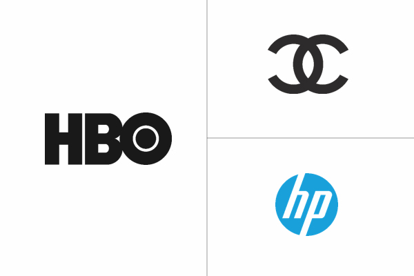
These logos are usually initial letters of the company stylized according to the brand to bring focus on the acronym itself. Examples of companies that use this logo type are HBO, Chanel, and Hewlett Packard (HP).
b. Wordmark Logos
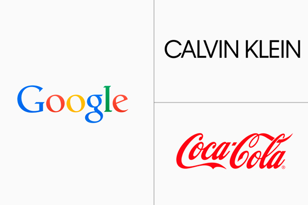
While a monogram logo makes use of the initial letters, wordmark logos focuses on stylizing the font of the business name itself. Popular examples are Google, Vans, and Calvin Klein.
c. Pictorial Marks
These logos are also known as a brand mark or a logo symbol which are images that iconized as the visual representation of the company, such as the case with Twitter, Apple, and World Wildlife Foundation.
d. Abstract Logo Marks
These are a specific kind of pictorial marks where instead of images of concrete things we can find in the real world, these focus on symbols, numbers, shapes, and colors and the meaning and symbolism behind them. Several notable examples are Nike, Pepsi, and the Olympics.
e. Mascot Logos
These logos use mascots, illustrated characters who represent the company, as the representative of your brand. This is a great way of giving a personification to your brand by bringing a mascot character to be like an ambassador for your business, Famous mascots used by companies are Colonel Sanders from the fried chicken chain KFC, Jollibee from the Filipino fast-food chain Jollibee, and the Kool-Aid Man from the Kool-Aid juice company.
f. Combination Mark Logo
When you combine different logo types together, they are called a combination logo. The combined elements are usually pictorial, abstract, and mascot logos meshed together with words or acronyms, such in the case with the logos of Mastercard, Dove, and Paypal.
g. Emblem Logo
Emblem logos are a specialized combination mark logo. It is comprised of two things: a symbol or an icon and the font inside it. Having been used by major institutions, these logos give a traditional and formal impact which are perfect for schools, foundations, and agencies. Nowadays, there are modern takes in emblem logos to keep up with the trends in logo design. Examples of companies and institutions that use emblem logos are Starbucks, Harvard, and BMW.
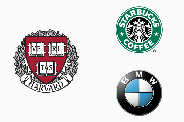
Choosing the right logo type will have to be coincided with the branding of the company. With the different styles available, you have several available options to choose from. A good rule of thumb would be to make one logo and to derive it into another kind of logo for different purposes.
Usually, it would be an image-oriented logo, a simplified version of it, and a combination logo that would be made in order to have different renditions of the logo for the company’s official documents, webpage, packaging, signages, promotional materials, and the like, such in the case of several corporate brands.
5. Try Playing Around With Negative Spaces In Your Logo.
Let’s take a look at the FedEx logo.
It is a wordmark logo using this shade of indigo and orange and a uniform block type face with no serifs. However, when you look closely at the negative space between the uppercase “E” and the lowercase “x”, it actually forms an arrow pointing to the right. This implies the moving nature of FedEx, a logistics and courier company with “The World on Time” as its slogan.
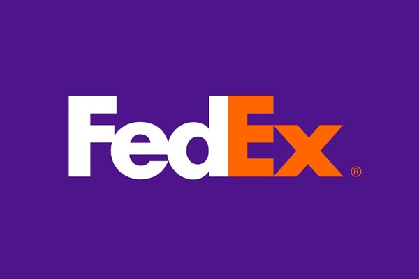
Being witty with how you use negative space can be a fun trick to use in delivering your brand’s message to the general public. There are other ways you can use negative space like different images depending on how you look at the logo and hidden images and symbols which all give a more insightful impression on what the brand and company is all about.
6. Play With The Proportions Of The Elements In Your Logo.
Proportions involve the relationship of space between elements of a graphic design. This gives importance to the size, positioning, presence of negative space, and even the weight and how all these factors harmonize together. You can actually use this concept to draw focus to what you want to bring attention to in the logo.
Do you want to make the picture in a combination logo stand out? Try positioning it at the center while the text is below it, sized down enough to be readable yet subtle. Does the logo look imbalanced? Adjust the sizes and spacing of the elements in a way that is not clumped together while still looking cohesive.
Basically, experiment on how you position these elements to come up with the most harmonious and impactful logo design.
7. Research And Collect Information To Identify Patterns And Trends.
The last tip in our list is more tied to the conceptualizing stage of our logo design. Research about different company logos and how they tie to the branding. This should be done with the intention to observe, not to imitate, but identifying patterns and trends on how these logos were conceptualized or revamped.
As important it is to be unique, we need to be inspired in creating and conceptualizing the company logo and one of the best ways to do this is to gather inspiration from already existing companies a
nd to find information on how they were conceptualized. Afterwards, you can then either find a completely unique concept and base your logo around it or give an existing concept your own personal twist while still remaining original in the final product.
These are some of the multitudes of tips we can offer in making your logo design journey smoother. If you want even smoother, interactive, and in-depth assistance in creating your logo, to reiterate one of our tips, consider hiring a firm offering a creative graphic design service to jumpstart your graphical assets needed for your business.






Well! I love your points but some are very old and already discuss no of time. Please add some fresh and useful tips. thanks