Usability is a crucial component in today’s business environment. Minor usability mistakes may annoy users, but major usability mistakes make it impossible to complete a task, giving your competitors an upper hand. But first things first, what is website usability?
The usability of a website refers to its ability to support intended tasks. Website usability entails the concise presentation of information and usability features. An example of web usability is the seamless user experience of the mobile app development company that guarantees smooth usability across different gadgets and browsers.
There are several reasons why you should avoid usability mistakes. The first one is increasing sales. If you run an eCommerce site, web usability facilitates quick purchases to increase revenue. Avoiding usability mistakes also slashes development costs since functionalities are simple and consistent. The following usability mistakes could be hindering your site’s performance.
1. Inconsistency Mistakes
In a bid to stand out, designers often make the mistake of overloading interfaces with many fonts and colors. However, this usability mistake leaves users more confused than impressed. Consistency plays different roles in website usability. The first one is reduced learning. By limiting the representation of operations, consistency eliminates the hassle of constantly learning new ways to navigate your site. Avoiding this usability mistake also enables users to find what they want by creating a logical structure of ideas. Additionally, consistency invokes emotional responses among users.
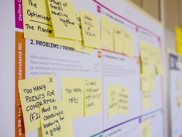
Good website design usability increases users’ confidence by reducing navigational mistakes when managing a site’s features. Consistency also saves time since designs have predefined components. Likewise, consistency is necessary for preventing branding mistakes. Your business is more memorable when users can associate your site’s URL with the company name, message, and logo. Web consistency takes different forms. For starters, visual consistency includes sizes, fonts, and buttons that impact a product’s learnability. Another category is functional consistency that comprises controls that work in the same way. Functional consistency enhances predictability to increase a user’s faith in your product.
Consistency could also be internal. Here, designers combine visual with functional consistency, enhancing a product’s learnability and usability. The last example is external consistency that matches designs from multiple products and systems. That way, customers can use the same knowledge for different products.
The good news is you can avoid usability mistakes and incorporate consistency into your website. Start by defining the visual hierarchy. Visual elements such as color, grid, space, and typography should originate from a central position as they spread to other areas of the system. Language also comes into play when preventing these usability mistakes. You can retain users’ attention by keeping your tone funny and friendly. Again, describe a product using the same terminology throughout the website to prevent confusion.

This goes together with using familiar layouts. Because of their interactions with different systems, users have a visual memory of a feature’s location on the screen. For instance, logos and exit icons sit at the top left and top right, respectively. Inconsistency usability mistakes could also arise from a lack of rhythm. Apart from their aesthetic appeal, web components should tell a story, so visitors know what’s coming next. Remember, avoiding inconsistent usability mistakes starts during the research stage. In addition to evaluating mockups and prototypes, conduct website usability tests throughout the design process to identify usability mistakes and confirm the site’s uniformity across various platforms.
2. Popup Mistakes
Popups are ideal for increasing conversions and turning visitors into subscribers. For example, popups increased the subscriptions and lead of SaaS company BitNinja by 114% and 162%, respectively. Popups also reduce communication mistakes by guaranteeing instant user feedback, and placing them on the FAQ section invites customers to rate your products and submit inquiries and complaints. These usability features are also versatile. You can use these usability elements to announce holiday hours and promote newsletters, new products, and social media pages.
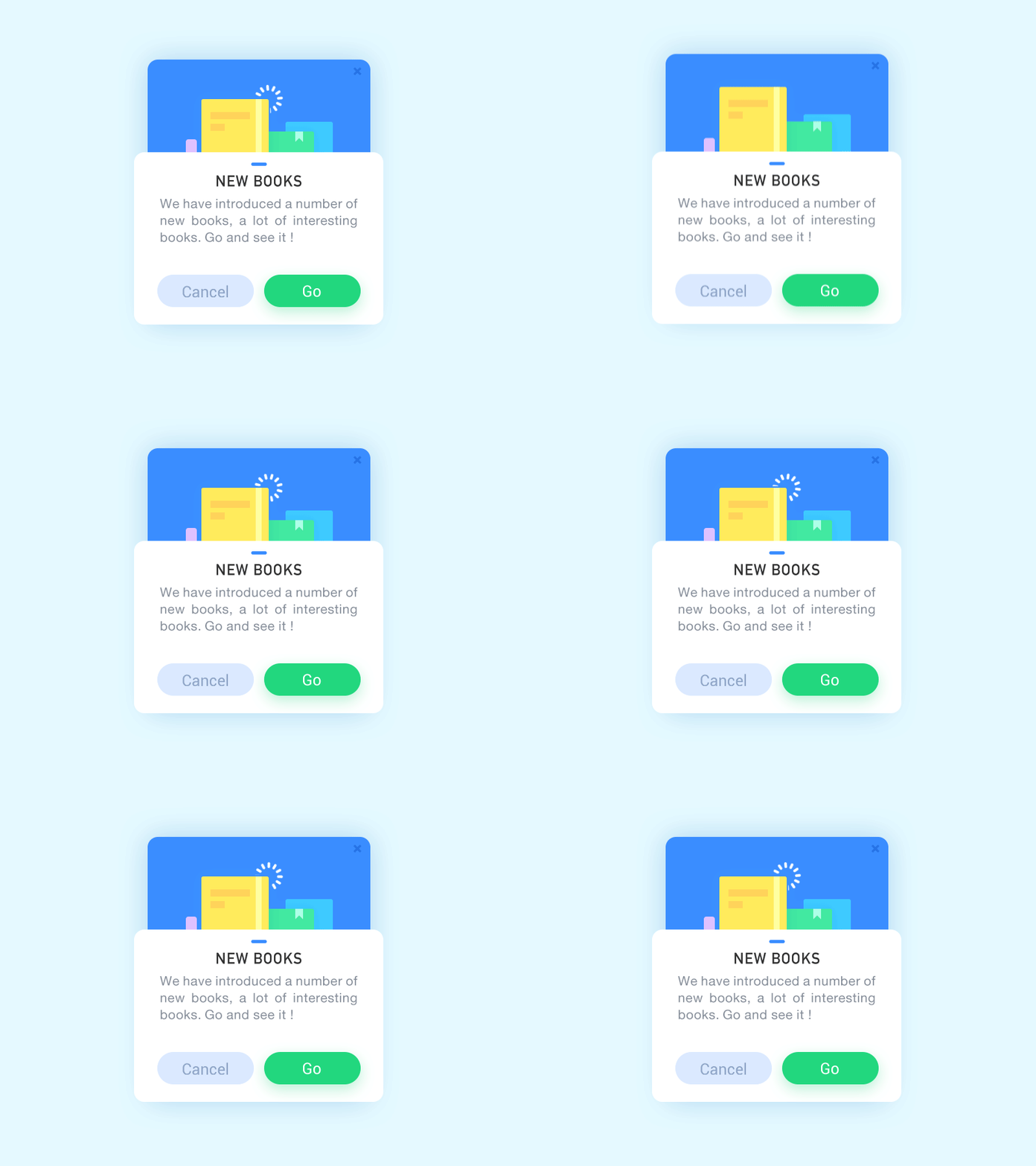
Another benefit of this usability feature is visibility. Whether they fade out by themselves or the user has to exit the popup, visitors cannot ignore these usability features. However, using popups excessively could annoy the user. The first mistake associated with this usability feature is displaying entry popups when visitors open the site. Users need to acquaint themselves with your brand before they’re comfortable enough to state their preferences or provide their email addresses. Entry popups also divert a visitor’s attention from the task at hand and increase bounce rates. You can give visitors around 10 seconds on your site before showing the popup. You could also time the popup based on visitor behaviors like:
- Clicking on particular buttons
- Visiting a particular number of pages
- Placing the mouse on a particular page element
- Scrolling to a particular point of a page
The exit intent also determines the timing of this usability feature. Since the user is already familiar with your services, you can try to add them to your mail recipients before they leave your site. The second usability mistake is complicating the popup. Too many words and form fields might affect your site’s functionality. This goes hand in hand with usability mistakes such as showing multiple popups. Rather than overwhelming visitors with many messages, use one popup for every advertisement goal, not forgetting usability mistakes like using ugly popups.

You can make popups interesting by including images and eye-catching colors. Note that the colors don’t have to be loud to catch the user’s attention. A contrasting black and white combination is enough to draw a user’s interest. Don’t forget to bold key phrases and include a call to action. Another costly usability mistake is hiding content with your popup. Some popups fill the entire screen and block content. Users are less likely to return to your site if it lacks valuable engagement. You can maintain your content’s visibility by using the sidebar or floating bar popups. Designers also make the mistake of having one popup for all users. You can avoid this usability mistake by studying your customers, segmenting them according to their geographical location and traffic source.
3. Content Quality Mistakes
Content is the graphical, audio, video, or written information displayed on your site for user consumption. Web content can range from blog posts and product descriptions to photos and landing pages. Several reasons explain why content is one of the most important website usability standards. For starters, this usability standard delivers value to site visitors. Your niche may be unique, but making content mistakes could drive your readers to competitors. Apart from answering readers’ questions, your content should evoke emotions and spark constructive discussions.
You also need content for lead generation. According to Trustpilot, 89% of customers check reviews before purchasing products. You can increase sales by creating product-specific content like instructional videos, FAQs, and product reviews. You could also motivate users to buy your products using a call to action. Additionally, great content portrays your company as an authority in your industry. Your site is likely to rank higher if search engines consider it a credible information source. Moreover, customers trust you more and recommend your services to their contacts if your content is free of mistakes.
Quality content has various aspects. The first one is grammar. Users won’t understand your message if the content has spelling and punctuation mistakes. Because content is the first point of interaction with your customers, users might lose trust in your brand when your site has grammar mistakes. Another mistake is overlooking images. Accompany your written content with photographs and infographics to capture your readers’ attention. The human mind interprets imagery faster than text. Again, your content should be useful to your audience. It’s not uncommon for writers to make the mistake of replicating content from other sites. Though you can borrow inspiration from other sites, build upon existing content to provide value.
Don’t make the mistake of ignoring titles. Headings ensure usability in several ways. For starters, headings eliminate the hassle of reading lengthy posts by making content skimmable. Headers also boost SEO. When users leave your site because of content mistakes, search bots assume your site doesn’t provide value.
Moreover, headings enhance topic identification to facilitate the ranking of search queries. It’s not enough to use catchy headings; you need to include keywords in your subtitles for better usability rankings. What’s more, keep your headings brief to prevent truncation by search engines. You can also promote the usability of a website by updating your web copy regularly. Fresh content shows search engines your website is relevant. Furthermore, users can depend on you to stay ahead of industry developments and provide factual information that doesn’t have mistakes.
4. Complex Navigation
Web navigation refers to the collection of interface components that direct users to a site’s features. While smooth navigation helps users transition between pages, design mistakes compromise your site’s usability. Navigation has many contributions to web usability. For starters, this usability aspect boosts SEO. Good navigation helps search bots index your site after crawling the web pages. Navigation also impacts user experience. If visitors make mistakes or struggle to find what they need on your website, they might lose interest and abandon your site for good. Navigation mistakes take different forms. The first usability mistake is ditching standard layouts. Most menus appear on a page’s left or top side.

You may argue that differentiation sets your business apart from competitors, but navigation isn’t the best experimental usability website aspect. The idea is to point users to your content, not teach them how to use your website. Another usability mistake is generic labels. Although past studies emphasize the importance of navigation for customer retention, designers jeopardize usability with the mistake of using vague navigation labels. Users may be accustomed to generic names like “Products” and “Services”, but these labels hold little meaning to visitors. Make the navigation descriptive. For example, you can use “Content Writing Solutions” in place of “Solutions” and “Marketing Services” in place of “Services”.
Apart from displaying your services to users, descriptive navigation keeps the site relevant to search bots. You can also include keywords in your labels. Another mistake is overlooking analytics. The first step of site improvement is identifying your strength and usability mistakes. Analytics tools provide behavior flow reports for a better understanding of your site’s usability mistakes and navigation patterns. By so doing, you know the starting point of most site visitors, what they click on next, and their last page before they leave your site. You can use this information to reduce your menu tabs and shorten visitors’ journeys to popular pages, not forgetting the usability mistake of overloading your navigation. Long lists complicate the process of selecting one item.
On the other hand, shortlists prevent users from making mistakes when looking for important items. Even if users pick one item, the remaining options still stand out. The arrangement of menu items also impacts usability. Users mostly focus on the items that start and finish the list. You can start with your favorite items, followed by the least important options, and end with the contacts menu, usually on the top horizontal navigation’s far-right. This goes hand in hand with recommending the next step for your readers. You could suggest similar blog posts or videos that users might enjoy before they leave your website. Concise navigation also impacts SEO. Too many links reduce the authority of your interior pages, reducing their ranking possibility.
5. Following Every Trend
There’ll always be something new in web design. A new trend will emerge and disrupt your design strategy even before you identify the current usability mistakes. Many likes on social networking platforms don’t make a design the best or free of mistakes. Additionally, attractive designs don’t necessarily translate to efficiency.

A common mistake among designers is following trends without conducting website usability tests. Even if your competitors are embracing the trend, take time to evaluate key performance indicators and find mistakes in the design to know whether a change is suitable for your brand. Some usability trends have the backing of credible statistics, reducing the chances of usability mistakes. However, other usability trends are just a strategy by bloggers to remain relevant.
Consider the following questions to avoid making usability mistakes on trends:
- How many top brands are embracing the trend?
- What problem does the trend solve?
- How does the trend differ from design patterns addressing similar problems?
Don’t make the mistake of ignoring usability trends entirely. Designers should know how industry developments impact user behavior. Trends evoke visitors’ emotions to determine how visitors react to your design. Remember, not all usability trends are temporary. You may make the mistake of ignoring a usability trend only for it to end up as a common practice. If you must experiment with a usability trend, compare it with traditional solutions and seek user feedback. Overall, choose intuitive and simple over cool and flashy to avoid mistakes with design usability trends.
6. Prioritizing Search Engines Over Users
In search of usability, website owners often make the mistake of prioritizing SEO over the readers who consume the content. It’s not uncommon for writers to ruin their posts by worrying too much about content length, local modifiers, keywords, density, and variations. However, search bots don’t need your content to be only about them. Google wants you to demonstrate your understanding of a topic by crafting informative blog posts free of mistakes.

As Google’s algorithm evolves, the search engine is favoring organic content over keyword-backed posts. Users will also ditch your site if it has too many mistakes or keyword stuffing makes it hard for them to understand your content. The good news is you can write quality content for your readers without compromising your search rankings.
The first step of avoiding usability mistakes is defining your content objective in advance and researching it. Even experts study a topic before writing on it to avoid mistakes. Create an outline of your article during this stage, segmenting your article into the introduction, body, and conclusion to prevent mistakes in the structure. Again, cite your sources, quotes, and statistics to add credibility to your work and avoid plagiarism mistakes. Don’t make the mistake of uploading your content before proofreading it. Ensure your spelling is correct and your posts are free of grammatical mistakes.
Here are some content types that resonate with readers:
- Opinions: Everyone has something to say. Rather than keeping your opinions to yourself, package them as content to drive engagement. Remember, there’s no mistake in sparking emotions with your pieces. Whether your readers agree or disagree with your sentiments, you still get traffic on your site.
- How-to Posts: These posts provide actionable tips for avoiding mistakes and solving common user problems. However, how-to guides aren’t new in the content world. To stand out from competitor sites, approach a problem from a new angle, maintaining simplicity in your posts.
- Emerging Research: Instead of regurgitating content from other blogs, you can keep your readers up-to-date with new development by presenting them with findings from recent surveys and experiments.
Another usability mistake is creating content for yourself instead of your audience. It’s tempting to write about your favorite topics and forget your readers’ needs. Identifying your visitors’ problems and answering them in your content is crucial to avoiding usability mistakes. Find out the news and events your readers follow and how these interests connect to your business. Keyword research provides insight into audience behavior. This way, you know the topics to cover and the language mistakes to avoid.
Conclusion: Conduct a Website Usability Test to Identify Usability Mistakes
Good usability takes time. In addition to in-depth user research, you need website usability testing tools to avoid usability mistakes and make your site credible, learnable, relevant, and available to users. Do you know how to boost website usability? Mention other usability mistakes and how to avoid these usability mistakes in the comments.


